
Eat
A yummy branding for Mammamia’s market launch.
Project description:
Work with Mammamia began in 2016 with an initial round of works defining the brand image and type design. In a rare case of early development for an immature market, it was decided to stop working on it and to resume it in 2020 with the appropriate legislation to sell the product without any debilitating restrictions. Mammamia defines the new rules of the premium but affordable product in the field of marijuana-infused cakes.
Services:
CREATIVE DIRECTION • BRANDING • STRATEGY • CUSTOM TYPE • GRAPHIC DESIGN • MERCH DESIGN • WEBSITE DEVELOPMENT
Created with Giustino Mucci and Mammamia.

Mammamia is a new brand in the cannabis market dedicated to producing gourmet cannabis-infused desserts and treats, blending Italian tradition with Californian innovation.
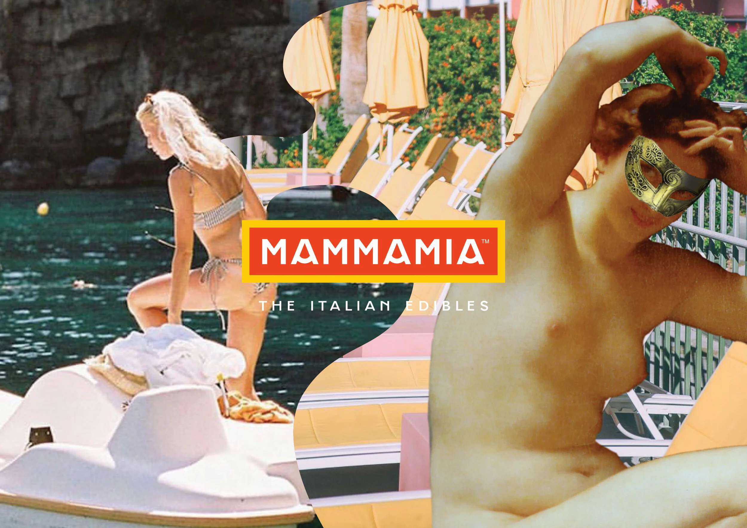
MAMMAMIA’s logo is a wordmark in the custom small caps version of Maria and it is bound in a rectangle, with the payoff presented beneath it. It takes its style from old Italian signage - boxed in above a shopfront - and the colouring from 1950s and postmodern pop references.

Proposals
The First proposal involved the sensitivity and feminine taste in a more subtle way, the soft colours tend more to a deeper experience and recall that Italian style which has its roots in quality and elegance.
The second proposal, which was the one accepted, represents vital energy, the explosion of colours tends to a more "superficial" experience, more immediate and easy to consume. Italian-ness is the one that still refers to quality, but tending towards the "good life", rather than the "dolce vita".


With its branding and imagery it is positioned for millennials, women, with a tendency to extravagant and slightly risque luxury. The website development was designed on a three-phase strategy (presentation, merchandise and entertainer), while the positioning strategy makes use of the American and Italian scenario - in a new concept that comes to life in L.A. Dolcevita, bringing back the Italian 1950s and its class, with an American twist:
Born in Italy, Baked in LA, or even better, Italian Tradition meets Californian Innovation! This is the motto of Mammamia.
Brand values
Mamma always knows what’s best in terms of food and life path.
We are a family, we are a group of people that works together with respect for a common cause. We want our customers to be part of our family: High quality, great taste, consistent experience, trusted brand...characteristics of all mammas. Our brand values include:
• Pleasure, life
• Culture, education
• Love, friends
• Ceremony, eating
• Nature, respect.


Mysterious, simple, arcane beauty meets pop, wild postmodern luxury, within a lifestyle brand and products. Mammamia combines the traditions of the old world with the new world approach.
Creation of a set of visual languages built on the brand values, that spreads well across mediums and formats for advertisements and merchandise.


Development of the Brand typography as the main tool for maintaining image consistency.
The shapes of Maria’s letters derive from a careful study of the geometric typographic tradition, from the German Rotunda to the Futura of Paul Renner. Great attention was paid to the letters of the uppercase alphabet, bordering on the uncial tradition.

Custom type design
Maria is a quirky character!
Maria’s letterforms derive from a careful study of the geometric type tradition, from the German Rotunda to Paul Renner’s Futura. A careful attention was given to letters of the small caps alphabet, verging on the uncial tradition.
Mammamia's brand is integral to the typography and the typeface in use, Maria. Maria was drawn specifically for the needs of the brand and it is always the predominant font in use.


Development of the sales strategy as a starting point for showing the products and the merchandise.
A line of merchandise, advs, formats for social media, packaging, physical and in-store materials was also developed for the launch. In the Covid period, a bandana was also designed to cover the face, with ad hoc graphics.


Escape to Italy
The MAMMAMIA brand can leverage Italian spirit as the custodian of a series of values of style and quality as well as being a potentially infinite source of content marketing that was crucial in building the strategy.
To do this, a strong point will be a constant, present content strategy that dialogues with the target and does not simply communicate the product.


Content strategy
Development of a multi-channel communication system with high customisation and possibility of extension in the identified streams.
The goal of the content marketing strategy is to establish a brand capable of enriching itself with quality and values thanks to the content conveyed, both thanks to the content itself and thanks to the visual form in which this content is shown.
The fundamental elements of a content strategy are the balance between the ability of the different strands to convey different objectives. From marketing levers, to "hooks" for users, to the ability to enrich and load the brand of values that it wants to express and that in the long term.


Taste of Italy
Discover Mammamia, visit their website.