

Maria
A quirky family of fonts with attitude.
Maria is a quirky character!
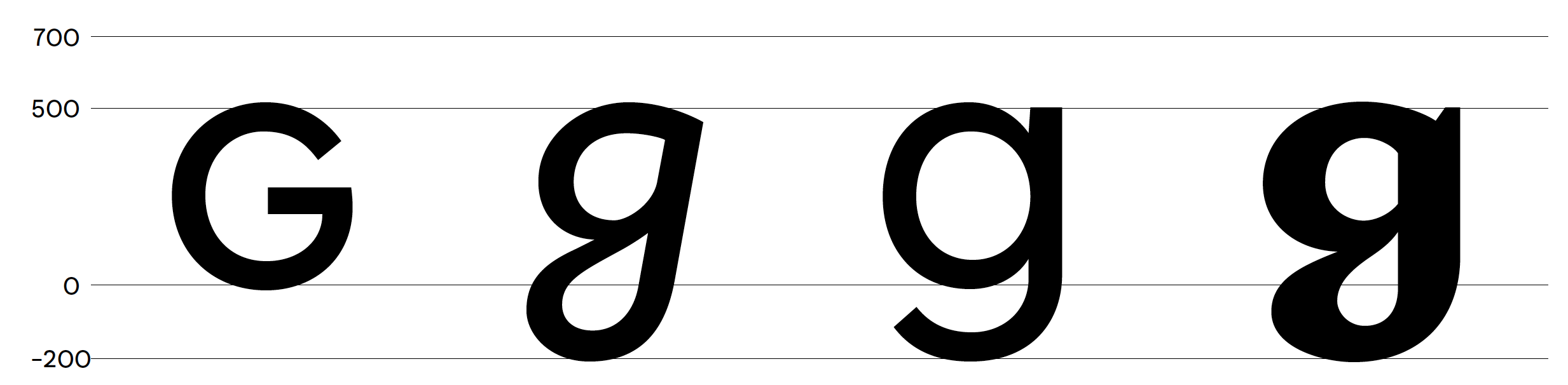
She is mostly Normal, a true regular, with small caps et al. But when the time is right she loves getting High; she loves the light funky-fresh feeling of the italic curls. Then the munchies kick in and theres only space to get Pumped and be extra Bold in the statements.
Maria’s letterforms derive from a careful study of the geometric type tradition, from the German Rotunda to Paul Renner’s Futura. A careful attention was given to letters of the small caps alphabet, verging on the uncial tradition.
Costum typeface for the company MAMMAMIA, an Italian edibles start-up based in L.A.
MAMMAMIA was looking for a typeface which also talked about the culture behind the product, the feelings associated with the different highs that the products entail.
Maria-Normal.otf
Maria-High.otf
Maria-Pumped.otf
Designed by Matteo Blandford, 2016
CHARACTER SET:


INSPIRATION:


Unleash your creativity
Contact us to get a license for the typeface.