

A fine branding for Panopus Printing
Project description:
The work with Panopus began in 2013 when I worked with them one summer after graduating in architecture. I got to know the company well and this informed the rebranding work that began in late 2019 with the aim of creating a website that was able to receive online orders and provide information on the blog relating to the work of the printing studio and artistic collaborations. Panopus defines the new rules of the custom product ordered online for an artistic audience.
Services:
CREATIVE DIRECTION • BRANDING • CONTENT DESIGN • GRAPHIC DESIGN • WEBSITE DESIGN

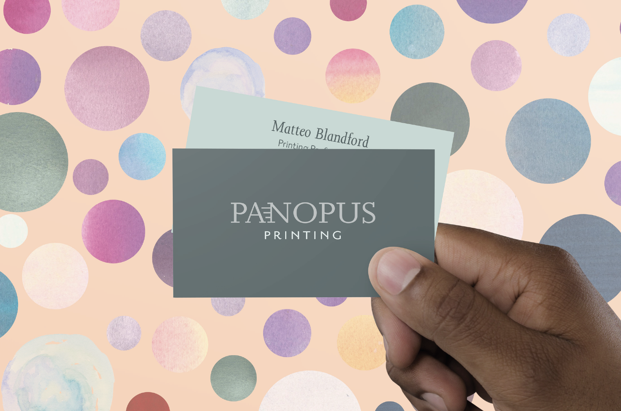
The original Panopus brand was the starting point, one can say it is a rebranding that refreshes the current look, though the approach is more a quiet one. The Pan has been removed, but the myths and the meaning behind the original choice were maintained. A return of the importance in the printed paper is the core concept for the proposal.
Born from the study of British typographic history, with particular attention to the independent printing of the early XX century, when alienation from the 2nd industrial revolution brought the arts & crafts movement and a comeback of the care for printing.
The tone of voice is one of formal friendliness, though one can find that in the order and attention for the details there is a quirky character and dark humour - typical for brits.


Branding
The chosen proposal was the last of three. The first proposal is based on the concept of making the Panopus reality a locally based, globally driven, business. The second is a proposal that dwells in the gritty element of all printed arts, before seeing the clean printed output that we are so familiar with.
After deciding on the chosen look and feel, the brand was deconstructed in logo, icon, stationery, webdesign and graphic design applied to the store, the delivery van, each product and merchandise.


Friendly & Fun
Established and Solid
Speed & know-how!
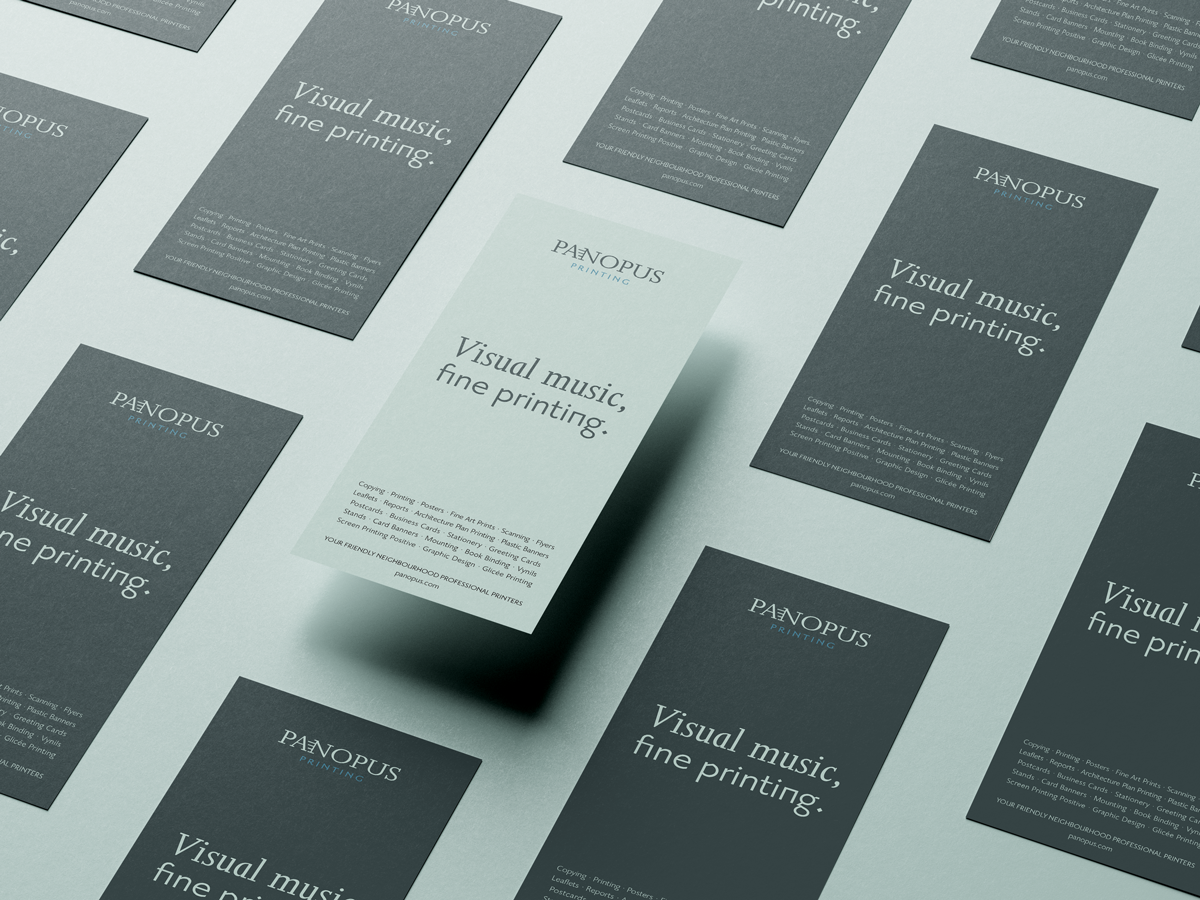
The brand is positioned so that it is both artisan and mother to the average user. The technical side becomes the art and artisanal element, and the care and attention given to the outputs is similar to that of a mother to a child. Definitely the more minimal of the three, this proposal is quiet, gentle and (for those in the know) fun! The music of printing machines will be cherised, but the love for the materials, for the paper and for the sacrality of materialising ideas will be the manifesto.

The e-commerce platform development work was performed on a three-phase strategy, while the positioning strategy makes use of the art scenario and light touch - in a new concept that comes to life in the tag line: ‘Make an impression’.
Development of a digital system with all the possibilities of customization, redirection and promotion of products - adaptable for both desktop and mobile - with strong control over product mockups thanks to the design of each image on them.
Development of delivery and packaging material with a new focus due to an increase in delivery orders - both for students and artists - also supported by a new newsletter.


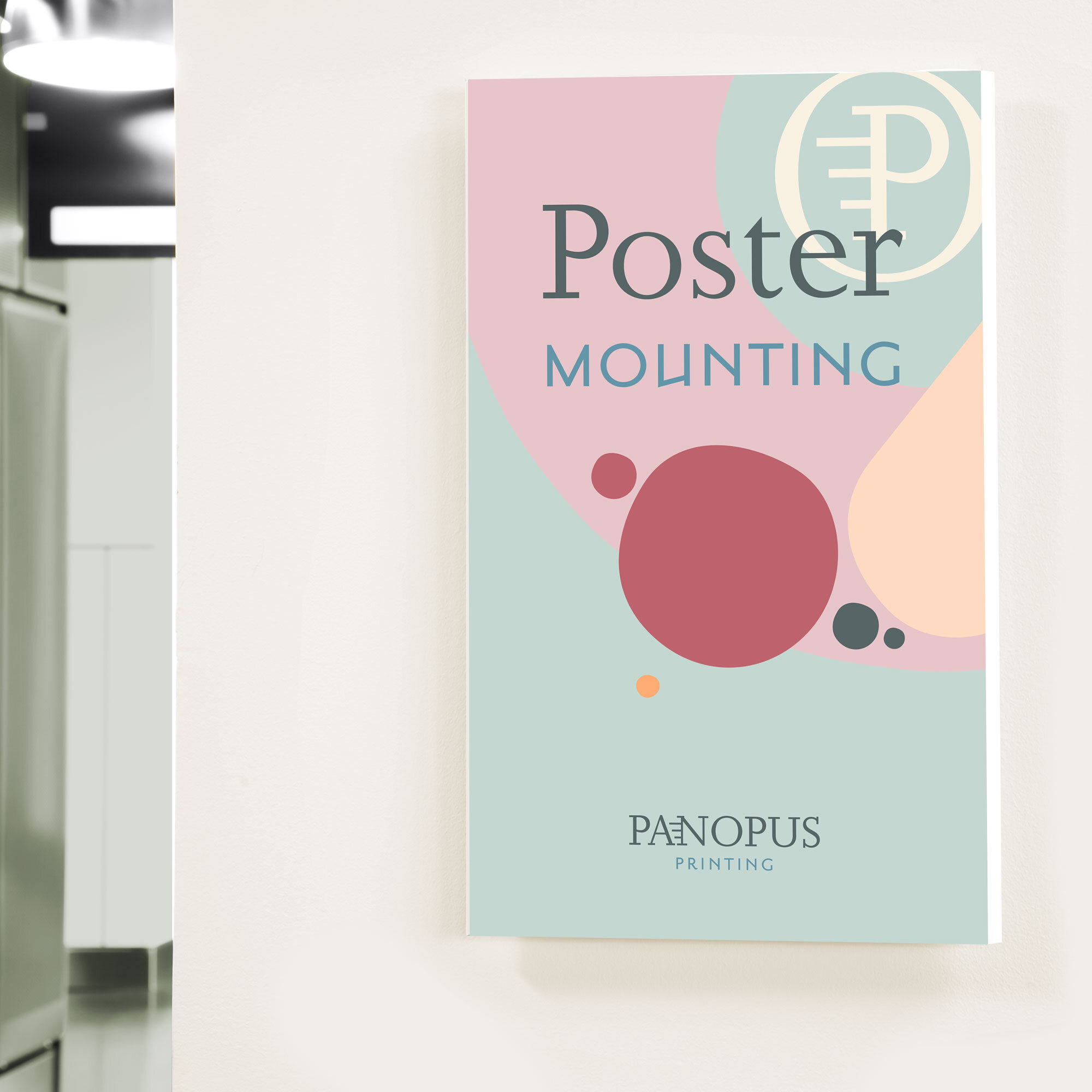
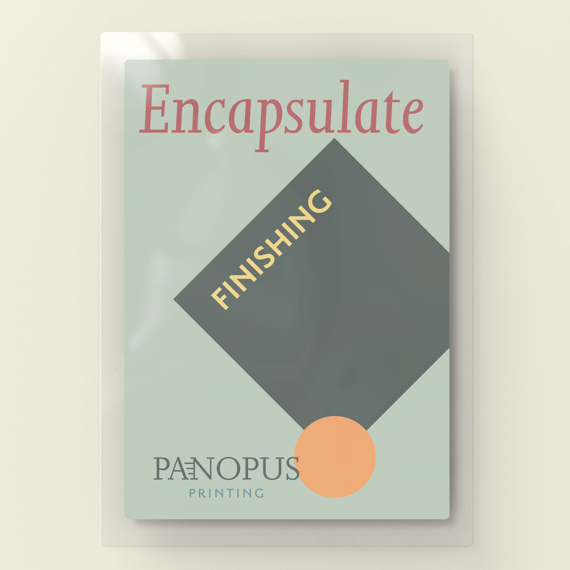
Product graphic design
In addition to the definition of the new brand and a useful positioning for young and digital audiences, the development of the coordinated image began with the definition of typography and colors, which were light and impactful in the ‘fine’ print. Adapted to a line of merchandise, advs, formats for social media, packaging, physical and in-store materials for the launch.
Ultimately this was translated to the graphic design for each product listed on the website and relevant mockup and image for the e-commerce platform.


Make an impression.
Discover Panopus, visit their website.