

Think
A complete restart for Casaleggio Associati.
Project description:
The work for Casaleggio Associati began in 2017 but intensified in 2018 until the launch of the re-branding in May 2020 - coinciding with the E-commerce report in Italy 2020. From the beginning the work was of creative consultancy for third party (commercial) clients, the internal activities instead came later which included the corporate rebranding and the new graphic editorial standards for the company’s semestral reports on e-commerce and exponential technologies.
Services:
CREATIVE DIRECTION • BRANDING • STRATEGY • GRAPHIC DESIGN • MERCH DESIGN • WEBSITE DESIGN • REPORT DESIGN • ILLUSTRATION
Created with Francesca Agostini from Casaleggio Associati.

The work performed is not simply a restyling, the brand is new and is built on an authentic and elevated, inspirational goal. Positioned for long-term growth and deliberately improving around a strong idea and bold goals.
The symbols and colors are inspired by a more pragmatic nature than the digital and traditional green of Casaleggio Associati. The proposal wants to touch the veins of cyberpunk, and science fiction of which CA is a master and a solid company.


Proposals
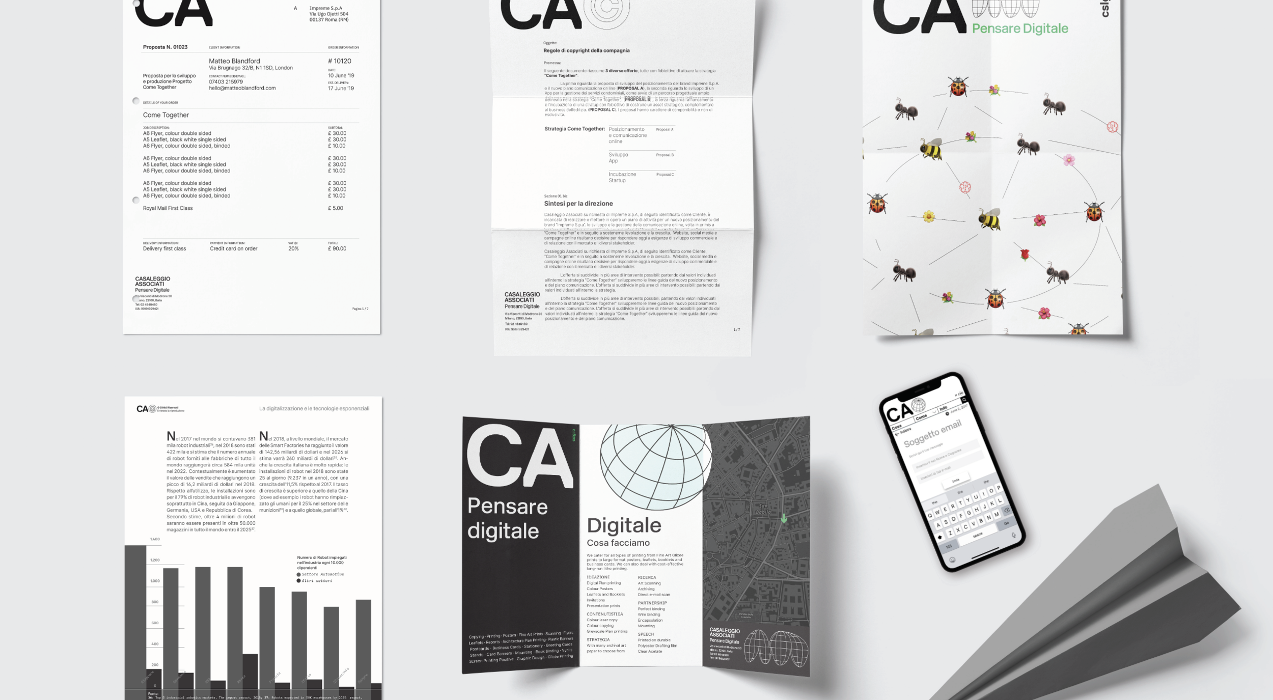
The First proposal, which was the one accepted, is inspired by the engineering and the precision of technology and the letterforms chosen aim for a solid contemporary look. The design took a functional turn in deciding the typography for its use in Google Docs, but integrated this challenge in the design proposal.
The second proposal was a direct evolution, a brand refresh instead of a radical change. The shapes represents a soft energy, the explosion of colours tends to a more "contemporary" experience, more immediate and easy to consume. The illustrations were aimed to introduce a larger audience as in this proposal it took consideration of the more educational and inspirational experience the web had in its early days - with a humanist touch.


Apply digital logic for a positive impact on the world.
Building empowered realities with respect to their offline life, conscientious of responsibility and power on the use of digital. CA is surfing the created tsunami, the trend of digitalization, and is open to a new identity and self-definition, bringing its experience with emotional connectivity and logics of experiences on the web.

The strategy which was a proposal then developed internally in CA, looked at strengthening the customer touch points and the real work inside the office, instead of a generally perceived one.
The aim was to communicate more of the consulting work by developing multiple ways to communicate the various messages. To talk of brand image, methodology and communication were proposals then complemented with internal expertise to further specify the messages.

Brand analysis and assessment
To think digital systems. Using the current structure of the company, the focus is realigned on the three strong points through a in-depth analysis and competitors/sector evaluation as a starting point.
Research:
The searches, which are the main entry point to the platform and offer.
How we work:
Smart thinking unites everyone in an ecosystem, the sectors can be exploded and represented in the context of the Digital Strategy offer.
What we do:
Innovation. CA can advance with business methodology.


Brand values definition
Thinking about the human future is a natural action and the application of digital is the rational answer.
CA’s new manifesto means thinking beyond tomorrow, about what will remain beyond our generation, aware of one's need to improve and aware of the permanence of actions on the web and of the risks of applying something new.
And to carry out effective actions for improvement, proactive, turning and pushing actions, research and execution processes in unexplored digital fields.


First empowering mover
CA’s new vision is embedded in its roots and its true nature, not its perceived one. A digital consulting firm which gives the tools to ‘move’ in a digital realm. The aim is to position CA as a better company, also increasing innovation in numbers by sharing the knowledge of the cutting-edge subjects in an interactive way, to everyone.
The first to: experiment and do traditional research for improved innovation
Relevant brand: genuineness of positive actions and progress
Being different: being active and methodologically applied

Website improvement which is rigidly organized around a brand. Website design, copywriting, image and type development (part of the rebranding) to strengthen the positioning of digital thinking in the application.
The website is developed to reach short term and long term objectives for CA, as well as to allow any day researchers to undertake a process of deepening the subject.


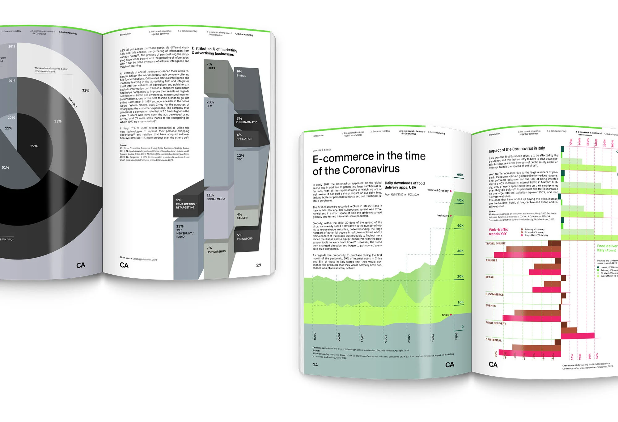
Duties carried out also include the development of the infographics and layout of the company’s half-yearly reports. Initially illustrated, and later with mini-websites useful for experimentation.
With the rebranding the standards were redesigned for the development of half-yearly reports: the “Smart Company” edition of November 2019 included the interactive mini-website to measure your company and how smart it is.

Thinking about the human future is a natural action and the application of digital is the rational answer.
Photography inspires the B2B audience digital transformation agents and departments, chief-level management, marketing departments, entrepreneurs, innovators, and in general a person interested in the critical vision of digital and the future. Specifying with a message of inspiration for CA's work is necessary, it is necessary to build value in the image of the brand's 'digital thinkers'.


Iconography and typography
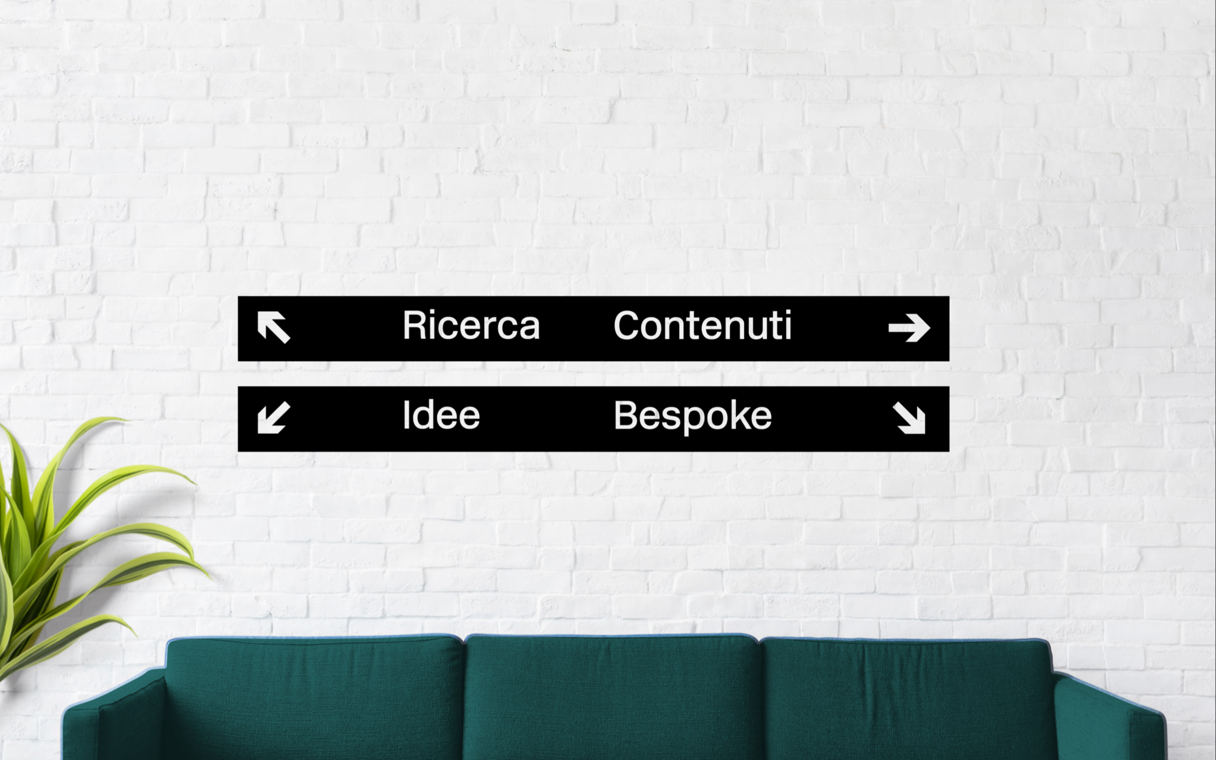
Typography and Iconography is rationally human, like CA. It has been conceived and inspired by the world of Milanese and European signage, and has been designed to maximise short messages with keywords, while legible in long texts across all applications.
It tells about the accompaniment on the journey of transformation that CA offers: A digital Inter-Rail. Icons and symbols can and must be combined to expand their meaning, these can be developed independently. The icons and key numbers of the slides can be placed in linear or full containers, a thrifty use of this style is recommended.
CA's main font is New Rail, which was designed for British railways in twentieth century, is a letter that makes use of strong legibility and rationalism. The forms can be considered precursors of fan-favourites recent such as Apple's San Francisco, Accenture's Graphic, Google's Roboto.
The complementary font, Inter, was designed to be screen-first. In development since 2016 for the Figma platform, the font was chosen for its shapes reminiscent of the Milan metro and for its fluidity, in fact it was born as a variable font and as a google font. This font is for everyone.
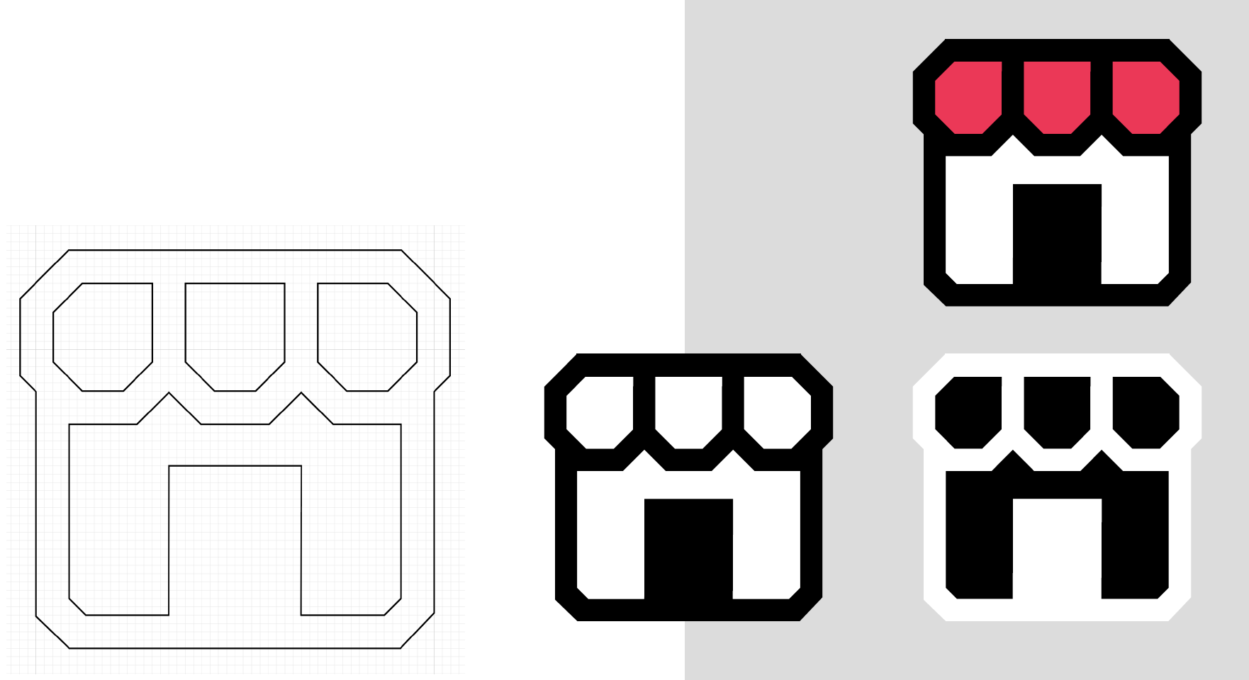

Icons are to be used sparingly to quickly communicate the issues listed.
The icons and symbols are constructed following the brand style, allowing for a colorful use, and with greater evidence than the textual content.


Think digital.
Discover CA, visit their website.