
Live
A new way of living and working together.
Project description:
Co-founder, head of communication and research and development, alongside the involvement on the administrative and corporate side, I branded and curated the graphics and typography of the social initiative in various multimedia formats from the very beginning.
The work for Le Seppie was born from the definition of the coordinated image, evolving over the years to the development of a coherent language through videos, photos, radio, web, also governing the creative direction and the work.
Services:
CREATIVE DIRECTION • BRANDING • TYPE DESIGN • GRAPHIC DESIGN • INTERACTION DESIGN • WEBSITE DESIGN • BOOK DESIGN • SOCIAL CONTENT
Created with Francesca Bova, Rita Elvira Adamo and Le Seppie.
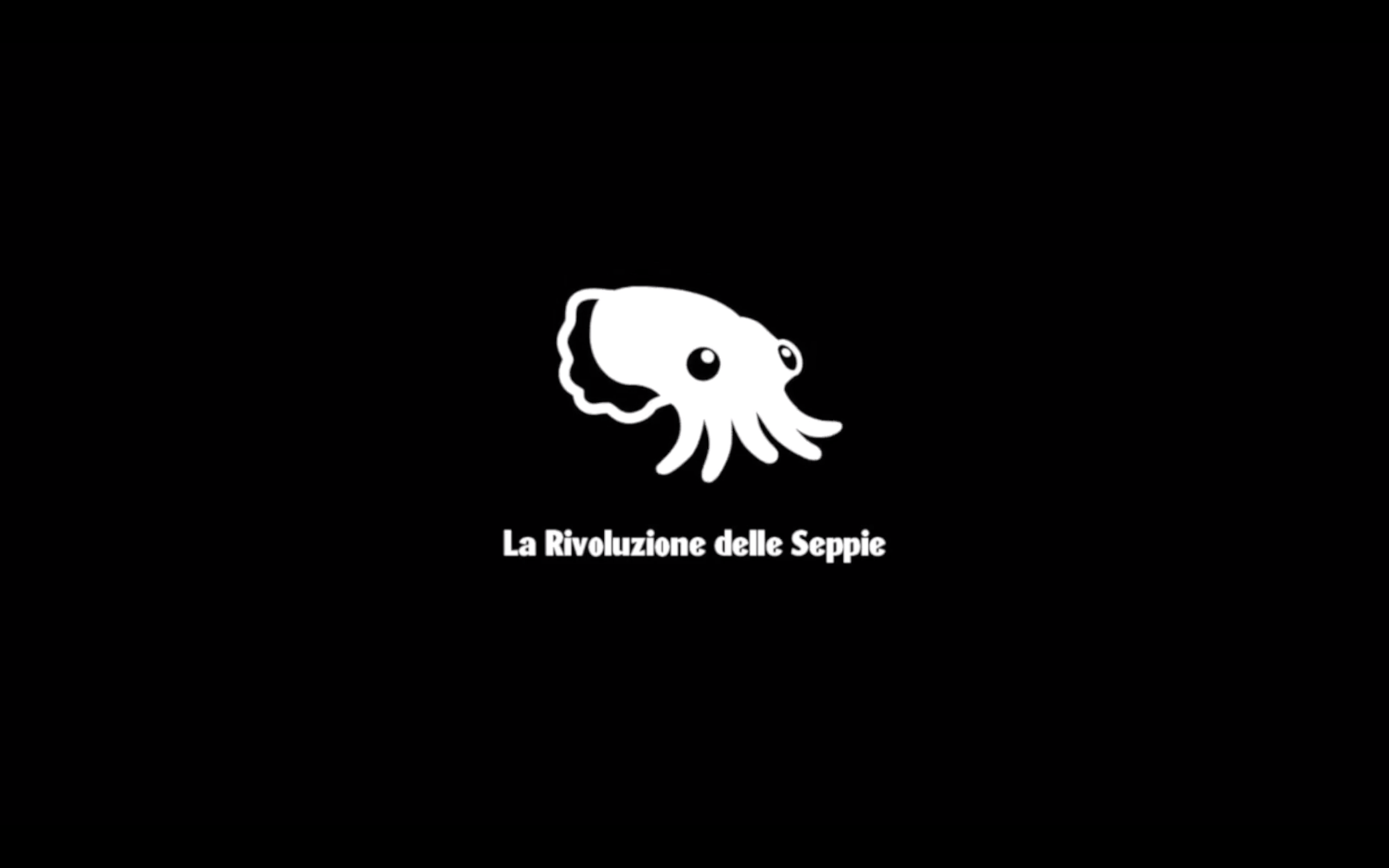
La Rivoluzione delle Seppie
Collaboration for public action
Cultural Association No Profit: For the cultural reactivation of the Calabrian marginal areas, Belmonte Calabro (2016-20)
The creation of the brand, in motion.
The logo came to be at the very beginning, in 2016, giving the identity of the squids. The name was inspired by a biology journal from the 1860s discussing the social qualities of the Vampyrotethis Infernalis squid that touches to learn its surrounding, the squids arrival in Calabria and learning as they went along, aggregating as they carried out their revolution in finding a new way of living and working together.
However, responding to the need to clarify the message communicated, organise the internal and external teams of the association’s collective, keep the level of content high and above all consistent between the disciplines, in the meantime, solutions have been proposed to the major problem that the association works to solve: to fight depopulation through cultural reactivation and non-formal education in the Calabrian marginal territories.


A brand is born from its typography
Ink is a custom typeface for La Rivoluzione delle Seppie to be used in conjunction with Rumori, by MuirMcNeil. Ink was designed in the first year to symbolise the fluidity of the group and to support the logo as the brand font.
Ink is an experimental set of letters.
It is not intended as a finished product, rather the beginning of a process of creation. The letters are intended to be enxpanded and played with, positioned as tightly as possible.


Make your mark
Create your Festoon >
The Belmondo Festoon project seeks an answer to: “How to start collaborative action to achieve active involvement and a new sense of belonging to Belmonte even if lived temporarily or remotely?”
By visiting the dedicated portal and drawing a line, a mouth, the eyes generated by the lettering created, a personality and a sense of representation are created.
Once you have created your own festoon, you have created your own ‘avatar’ character who will live in the Belmondo ether as an inhabitant and supporter of the manifesto.


Creative direction of the communications team.
From 2019 flanked on the strategic and marketing side by Francesca Bova, a greater diffusion of the message began and with it therefore greater collaborations to keep active and a diversified work.
We provided supervision and coordination of project disciplines in the creation of videos, graphics and contributions to the formulation of ideas. The work of Le Seppie is diversified in its approach, united by the ultimate goal of project communication.


Creating & Teaching
During the workshop weeks (four times a year) I take care of the organisation and development of the communication laboratory. In its first year with the aim of developing a Fanzine, in the second year by coordinating a round table with other guests interested in themes similar to the project.
The 2019 talk, “Identity, power and revolutions in Printing - Letters as social protagonists” was also discussed at London Metropolitan University.


INK36
Le Seppie Fanzine
The project was born in conjunction with the Visual Communication workshop of Crossings 2019, the initial intent is to start from the visual listening of the Bemonte place, to then examine the right components and values using keywords collected and discussed around a work table. of a new community.
It was an overwhelming process in which people from different cultures and backgrounds inspired each other and created a magical energy that is difficult to fully represent through images and text.
The fanzine published October 2020, in Belmonte C., was created to define and communicate the results of the Glocal Tools workshop. With contributions by Roberto Zancan, Marco Brizzi and Labo Binazzi.


Be more squid
Discover La Rivoluzione delle Seppie, visit their website.