
Cook
Brand, evolution, and finally Prevenzione a Tavola
Project description:
Prevenzione a Tavola contacted DO in 2017 to create the icon logo and a basic set of graphics which evolved in 2020 with a 360° look at the multimedia reality the academy became. Prevenzione a Tavola is the only academy that combines cooking, science and the philosophy of nutrition to improve your lifestyle.
The brand required a multifaceted reality and needed to be governed from the creative direction of the recording of the videos of academic content to the web design to deliver the content. The social media formats were redesigned and the illustrations for the website were created in conjunction to the typography.
Services:
CREATIVE DIRECTION • BRANDING • GRAPHIC DESIGN • WEB DESIGN • TYPE DESIGN • SOCIAL MEDIA FORMATS • ILLUSTRATIONS • VIDEO FORMATS
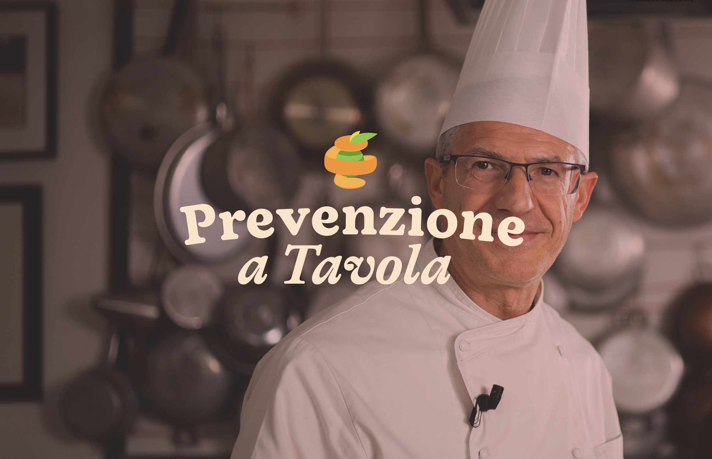
Photography by Claudia Biondini,
Strategy by Francesca Bova and CA
Prevenzione a Tavola
L’accademia dell’alimentazione consapevole.
Nutritional Academy, Milan, Italy (2020)


Prevenzione a Tavola is the: Academy of conscious nutrition. The only online course academy that brings together the science and philosophy of nutrition.
The starting point to illustrate these values was the development of a moodboard and subsequent typography. The logotype starting point was the Auntie Serif typeface, specifically the bold custom weight designed and the italic. The accompanying typefaces were selected from a careful study of the message it intended to deliver, that of artisanal yet refined cousine.
Color palette, explored the concepts further, it features the bio-friendly colours suggested in development. The logo colouring can be made up using any combination of colours in the same palette. The icon remains the same and it was developed in motion.


The content was varied: courses, news and insights into conscious nutrition supported by doctors and experts in the sector. The brand strived to disseminate and create food awareness, through recipes, advice and pantry organization thanks to the properties and benefits of food, to improve living conditions.
The starting point to illustrate these values was the development of the new website and social media formats. Each to include a specific stream of communication which ultimately we wanted to convert into sales.
The videos were also addressed and creative direction was given to the various collaborators ranging from the still life photographer, the videomaker and his assistant, as well as during the post-production of the content. Strategically, conversations were had to align with the previous iteration of the brand and to incorporate enough, yet innovate, to avoid the double cost of production and content review.


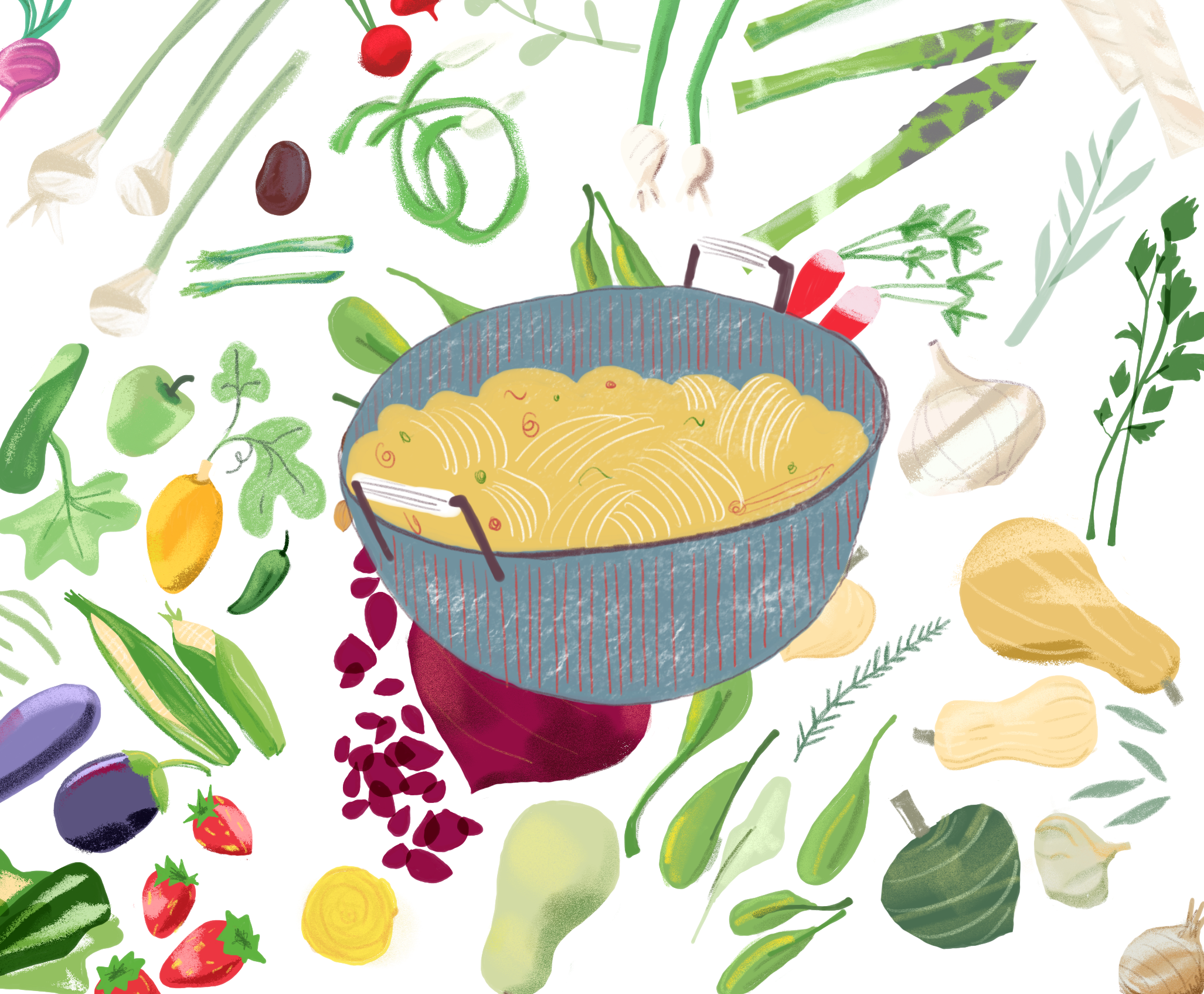
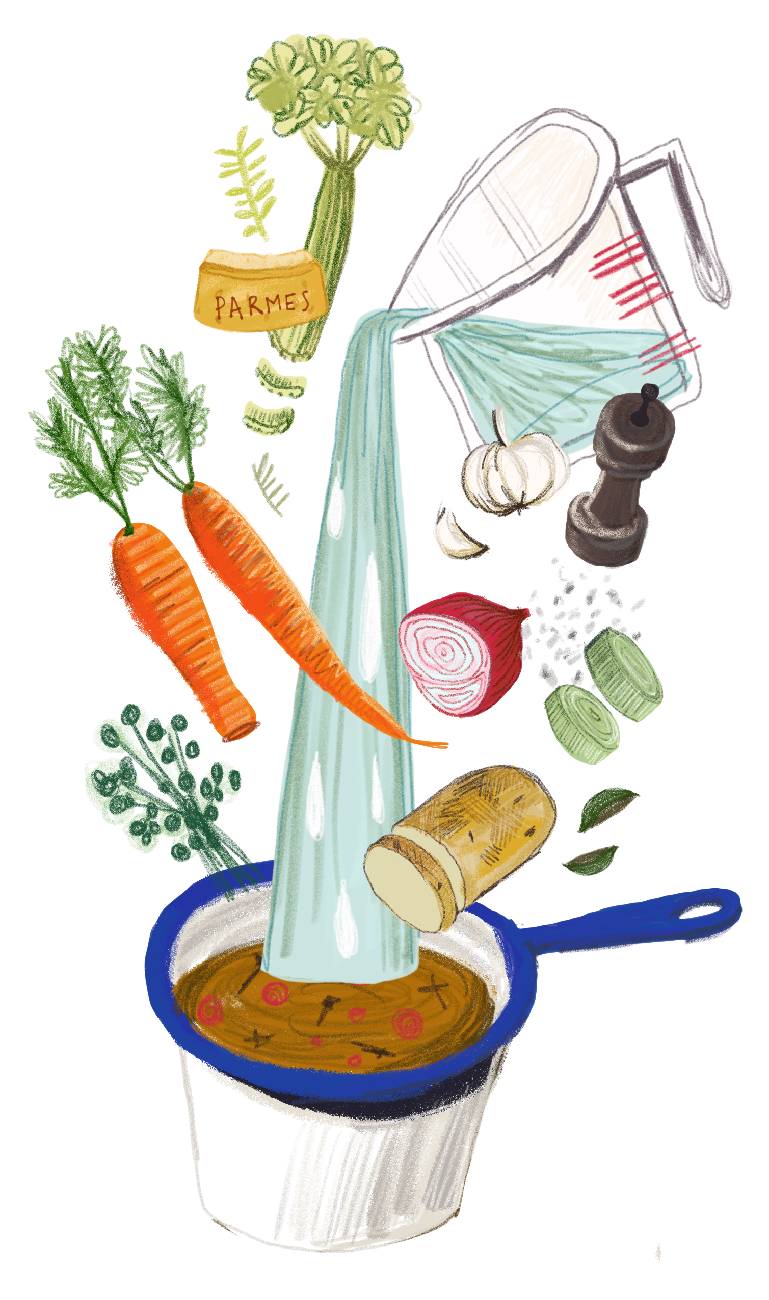
Illustrations
In addition to the definition of the new brand and a useful positioning for young and digital audiences, the development of the coordinated images began with the definition of the web design: specifically drawn illustrations were provided to the client. Adapted to a line of content-specific sections of the website, advs, formats for social media, packaging, physical and in-store materials for the launch.
Ultimately this was translated to the graphic design for each step of the experience navigating the website and the e-learning platform.


Academy of conscious nutrition
Discover Prevenzione a Tavola, visit their website.