

Learn
A constant evolution for L’albero di Momo.
Project description:
A client since 2013, the relationship with L’albero di Momo and its network started with a small project to refresh the office material, followed by a rebranding process finished in 2015 to include the franchises in Turin, Milan and Lugano, to then a digitalisation process undertaken in 2018 with five-year projects to add new revenue streams with online games.
Services:
CREATIVE DIRECTION • BRANDING • TYPE DESIGN • GRAPHIC DESIGN • GAME DESIGN • WEBSITE DESIGN • BOOK DESIGN • SOCIAL CONTENT
Created with Alessandro Poletti, Virginia Ratti and L’albero di Momo.

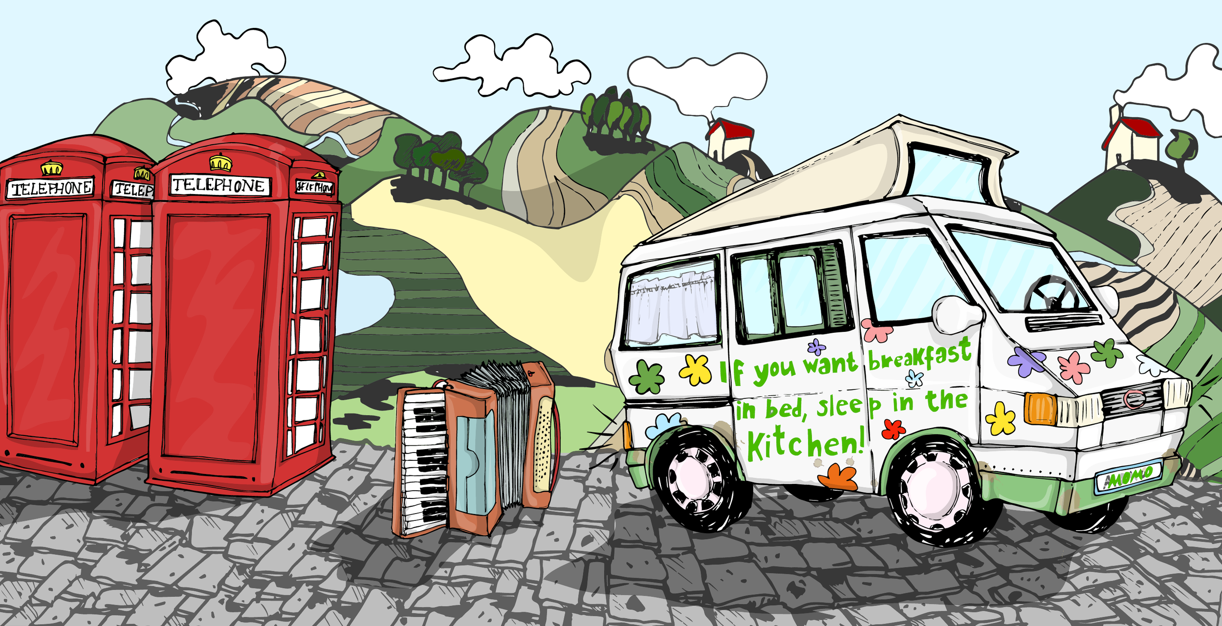
The logo for L’albero di Momo was created as an illustration prior to the start of the work. We wanted to maintain the heritage, creating an environment of visual elements around it. From the graphic design to the typography the brand is multifaceted and the visuals have been made to facilitate its applications.
We created a new brand kit of images and illustrations to expand the new look and to be fluid in the teaching application in class; two own fonts have been developed for printing and web use - one is the brand-font and the other a font to give voice to the animals in the illustrations.
Along side the teaching of kids, the brand also teaches the tutors in the method thus the clientele of different ages was taken into consideration.

It’s easy, it’s simple, it’s ABC!
L’albero di Momo developed into a franchise, expanding in the North of Italy to Milan and Turin, together with the headquarters in Como and Lugano, in Switzerland. The restructure of the company allowed the creation of multiple brands powered by L’albero di Momo.
The logos of the franchisees were created with the brand font and to each brand a mascotte was associated. The penguin, the monkey, the rabbit and the bear from the head brand, created the characters that featured in company videos and the individual brands communication. Thus each school can be different enough to have its own graphic design whilst maintaining the vicinity of brand.


The teaching method as a visual and colourful world of characters.
The genesis of the work comes from the highest understanding of the educational method in use - both Emotional Learning and Emotional Teaching and Jolly Phonics - and was written and designed together with the school director.
Children’s school books, teachers guides, games, visual cards, online materials, and more where created through the years to accomodate the expanding own method and to embrace the Jolly Phonics method that L’albero di Momo was teaching.

Coordinating with the client I managed collaborating artists for the creation of the teaching materials, as Grade 1 and Grade 2 school books, the Momo learning manual, the Momo Boxes and the Grow Your English logo.
From the beginning of the project, the objectives for different specific purposes had been outlined in an incremental manner for a year after year growth, adapting for each correct application the designs created.

Emotional learning emotional teaching
To learn and teach emotionally. Using the tested method, the focus was in creating a coherent visual language across all materials focusing on an immersive experience, hands on storytelling devices, vocabulary and phonetics illustrated.
Books:
The methodology book was the main entry point for teachers to grasp the extent of the teaching scope. The Momo’s Abc is the main tool for the kids to learn.
Games:
Starting from the premise that learning should be attached to the emotional experience, interactive and situational games were created with the headmistress.
School materials:
Books, postcards, posters, project books and other materials for all the schools were created to aid in the classroom.


Commercial identity
Bring the teaching outside of school, making it an experience.
L’albero di Momo’s graphic design and branding was differenciated between the in-school materials and the more commercial side. The starting point was to convey teaching also in the administration materials, thus creating business cards and loyalty cards to reflect it.
Posters, flyers, out of home advertisements, stationery, were among the mediums designed for the brand for the execution of marketing campaigns.


A child learns most at home
With the rise of online learning and the intent to design L’albero di Momo to be prepared for such a change, a strong online presence was created. Social media channels editorial plans were develop to include also social responsibility and teaching tips, course carousels and image formats, social galleries and link adv.
In January 2021 the sale of digital teaching products went online.

The world around education has been developed and expanded for social media channels - including among others: social responsibility and digital products.
The illustrations created for the teaching materials have been repurposed also for the content strategy. The ease of use of the illustrations, created by Virginia Ratti, has allowed for a crossover of visual materials across the company at all levels, in and out.
The new family of websites programmed by Alessandro Poletti was launched in 2018 to also integrate the online purchase of a lesson or of a course. This allowed the streamlining of administration processes, especially in busy months such as September.


The development of digital systems goes to solve the problems of organisation and administration of the office - for example by facilitating ‘funnel’ moments for calls during registration periods - with an online reality.
The creation of landing pages specific for commercial offers has also been developed with Alessandro Poletti, programmer, whilst coordinating with the product manager in touch with the tutors from around the world.
L’albero di Momo and it’s easy! take pride in having the majority of bilingual summer staff and the online video-chats developed during COVID-19 first wave allowed to have the same international staff all year round. Though in different timezones, the web system allowed easy coordination and execution of the booking for a class from the students.

Iconography and typography
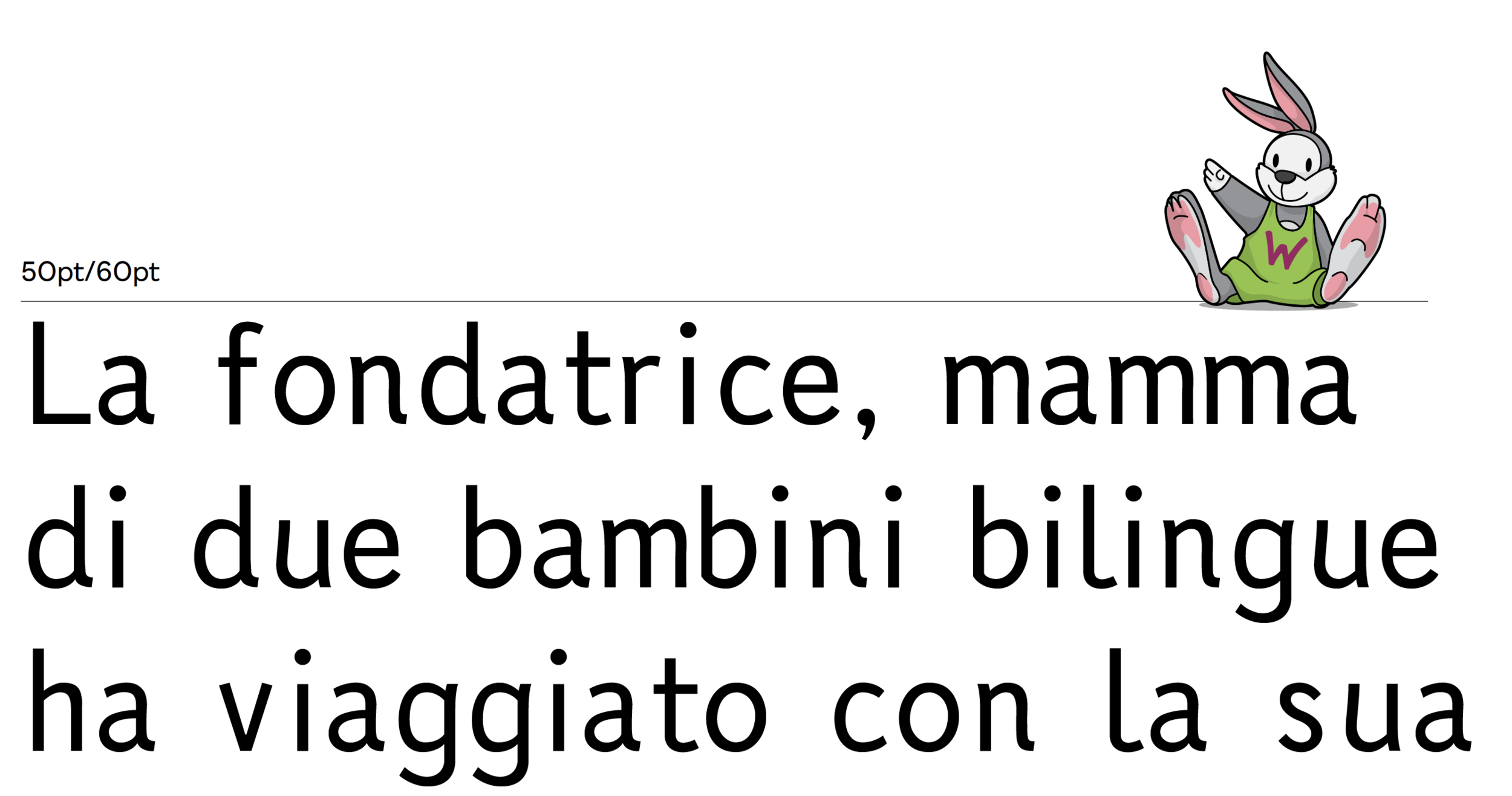
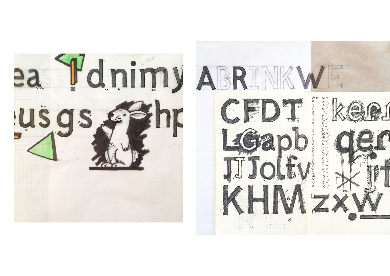
The typefaces for Momo were developed for textbooks and with children and illustrations in mind, thus Rabbits and Piggies was born.
The founder of the school, and author of the method “Emotional Learning, Emotional Teaching” by Elisabetta Mohwinckel was looking for a custom font to unify the brand of the franchisee and to be visually coherent throughout the North of Italy where the schools are based.
Rabbits and Piggies are custom font for the schools of L’albero di Momo.
Rabbits was created in 2015, since then it was used in books, games and exercise books for kids & parents. The proportions of the letterforms derive from old-face romans, specifically Adobe Caslon. The simplicity derives from the likes of Sassoon an Easy reading, other industry’s standard fonts for schools.
Piggies was born in 2017 as a complementary character to Rabbits.
Piggies letter shapes were initially drawn with a large wet round brush, on a large scale, later digitally refined.
Rabbits


It’s easy!
Discover L’albero di Momo, visit their website.