

Shit
Brand launch for Betterway
Project description:
Betterway contacted DO to produce the branding, graphics, packaging and social media strategy. The brand believes in low impact on the planet by means of toilet paper, so the project sought to display it everywhere.
Betterway presents Maria and Auntie Serif, two typefaces developed internally, the latter modified for the logotype version of the brand. Copywriting was also created, albeit largely in collaboration with the client.
Services:
BRANDING • GRAPHIC DESIGN • PACKAGING DESIGN • TYPE DESIGN • SOCIAL MEDIA CONTENT

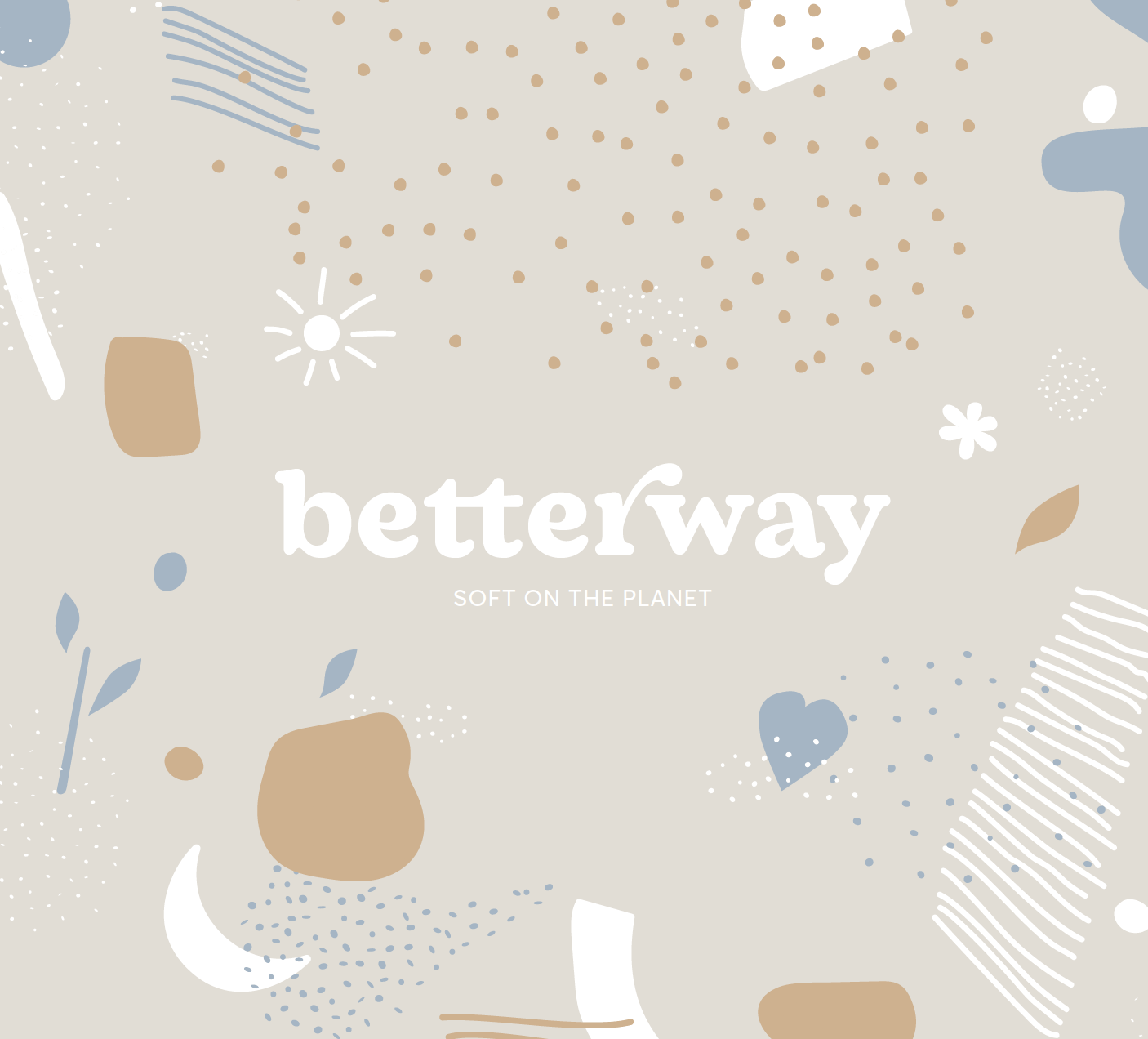
Soft on the planet, and soft on you. Switching to tree-free toilet paper is a small change that has a big impact on the future of our forests.
The starting point to illustrate these values was the development of a moodboard and subsequent typography. The logotype starting point was the Auntie Serif typeface, specifically the bold custom weight designed and the semicondensed. Maria family, specifically the normal and high weights. Both designed by Matteo Blandford and with very limited releases.
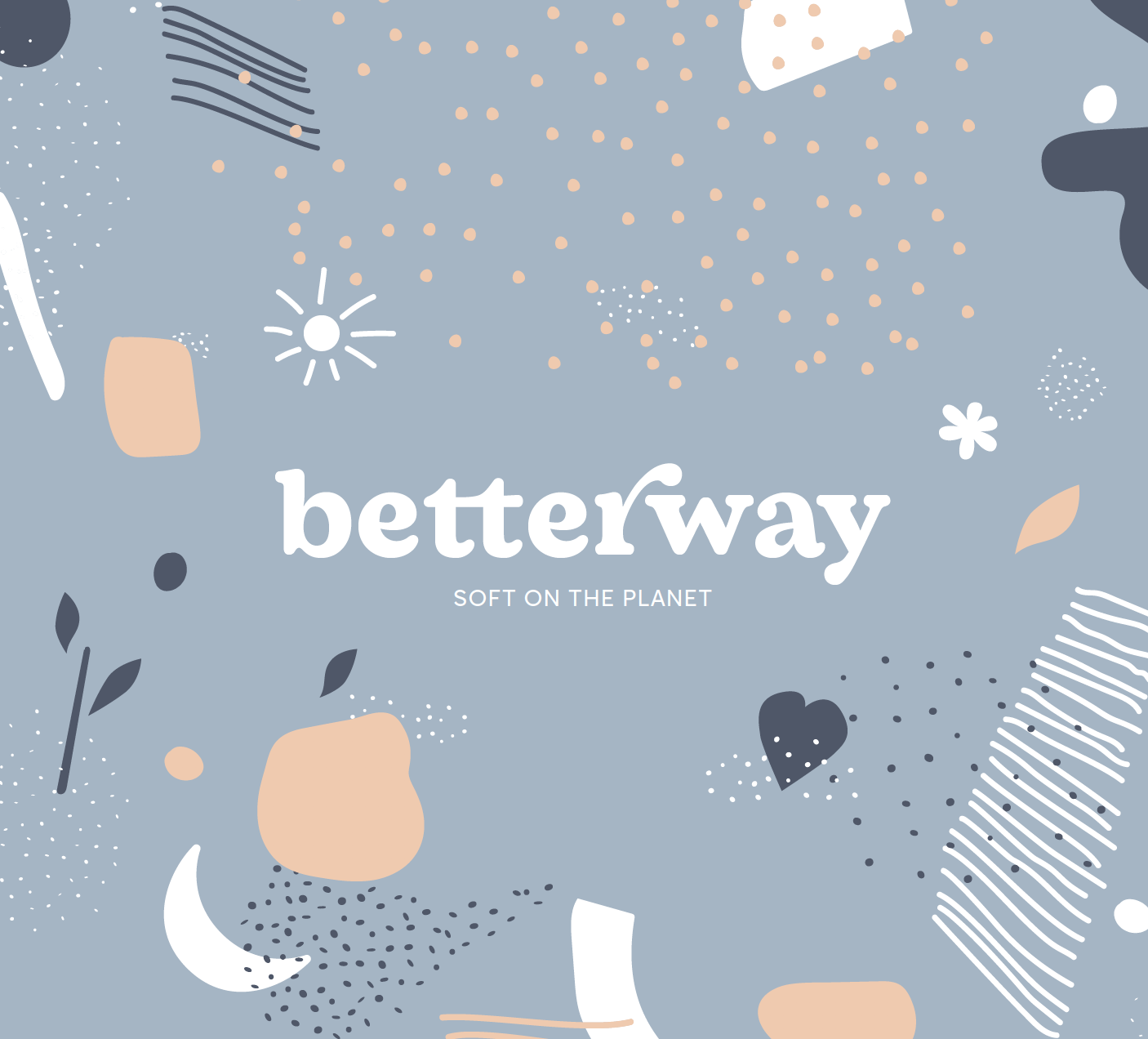
Color palette, explored the concepts further, it features the bio-friendly colours suggested in development. The logo colouring can be made up using any combination of colours in the same palette.
Born from the study of soft imagery based in millennial trends, Mirò and the saturated colours, with particular attention to the teen photos of the early XXI century, when alienation from the reality of economic crisis brought a heightened sense of civic duty and environmental attention, Betterway is founded on the simple fact that there is a better way to be soft on the planet.


Product graphic design
In addition to the definition of the new brand and a useful positioning for young and digital audiences, the development of the coordinated image began with the definition of typography and colors, which were light and recalling the natural cycle of toilet paper.
Ultimately this was translated to the graphic design for each product listed on the website and relevant mockup and image for the Amazon retail page.


Brand messaging
A cleansing Toilet experience, made of bamboo.
The chosen proposal was born from an iterative process, of feedback and constant contact with the clients. The first iteration was named Lushland and was the proto version of the final result. Other names taken into consideration were Shift and Betterway, but they were born out of different cultural traditions. The first was a asian looking style, the latter was very minimal and light.
After deciding on the chosen look and feel, the brand was deconstructed in logo, icon, stationery, webdesign and graphic design applied to the Amazon store, the delivery box, each product packaging and merchandise.


Amazon imagery

Instagram imagery


Soft on the planet.
Discover Betterway, visit their website.